01
Overview

About Riddhima

7 years translating complex challenges into high-craft digital experiences.

02
Commerce Project

Personalised Retail

Multi-billion-dollar client win • Personalised agentic wardrobe

03
Fintech Project

Retirement Agentic

B2B Platform • Compressing Enrolment by 80%

UX Designer

@ Deloitte

2022–Present

Product Management Mentor

@ MyCaptain

2025–Present

Behavioral Design

Product Building

Agentic UX

Storytelling

Illustration

Retail • Pitch case study

Personalised Retail Ecosystem

How a design question became the concept that won a multi-billion-dollar client.

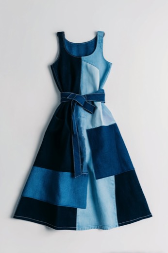
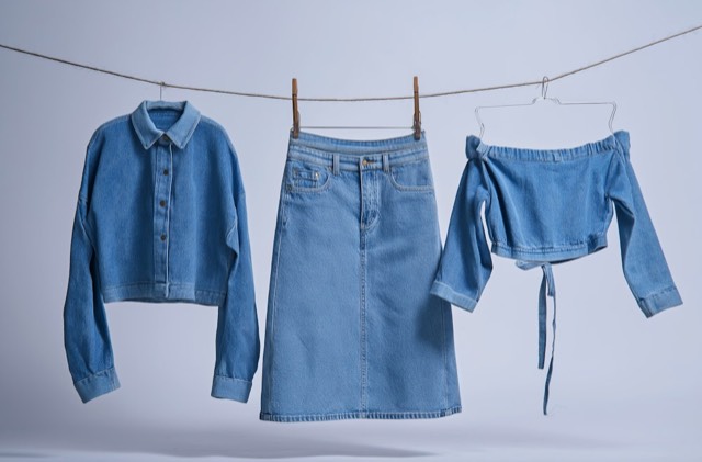
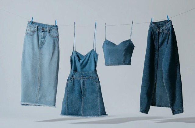
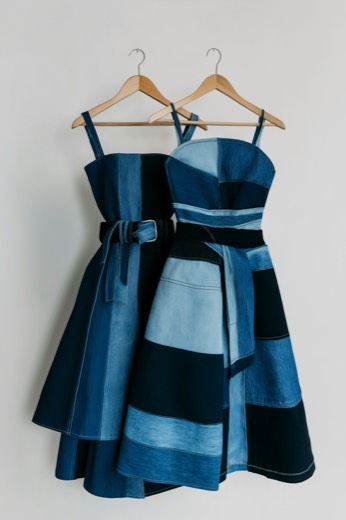
Tidewell Denim Co. campaign image: a model in an oversized dark-wash denim jacket
TIDEWELLDenim Co.

01 · The question

Moodboards feel personal. Online stores feel like billboards.

In early 2025, a product manager and I kept asking one question: why does a moodboard feel so personal? In creative work, it comes before anything else. It says: this is made for you.

E-commerce does the opposite. You land on a homepage and get banners, promotions and seasonal pushes. It’s the same store for everyone, with no room for the person actually there.

That gap became our concept: a store that keeps reshaping itself around one buyer. Not just recommendations. The buyer walks into their store.

02 · Research

Gen Z wants a store that knows them, and trusts people over brands.

We had 2 weeks to pitch a heritage denim retailer that was struggling to win and keep Gen Z in a crowded, increasingly AI-native market. Week one went to research: the retailer, its competitors, and what Gen Z expects from a store.

Taylor, our persona: a teenager in a patchwork denim jacket

Taylor, 16

Persona · high-school student, US

Shops to express herself, but is overwhelmed by generic curation.

What Gen Z told us (survey)

  • 84%expect a store customised to them
  • 76%trust peers and creators over brand ads
  • 92%are fluent in swipe interfaces

Where personalisation stood

Key insightPersonalising the whole experience, not just the product recommendations, was the opportunity nobody had taken.

How we researched
  1. SWOTThe retailer’s position
  2. PESTELForces shaping retail
  3. Porter’s five forcesCompetitive pressure
  4. Brand auditType, colour, imagery, layout
  5. Gen Z surveyExpectations and trust
Competitive pressurePorter’s five forces, as rated in our analysis. Hover a row for the reason.
ForcePressure
Rivalry between brandsHigh
SubstitutesHigh
Buyer powerHigh
New entrantsMedium
Supplier powerLower*

*Not rated in the original analysis; described as reduced by a large supplier base.

03 · The idea

Don’t rebuild the store. Give every shopper a wardrobe inside it.

Rather than reimagine the whole storefront, we proposed one feature inside the existing experience: My Wardrobe.

The metaphor was deliberate. A wardrobe is intimate. It’s yours, and every compartment knows what belongs in it. In My Wardrobe, every card is an agent that talks to the others, learns and curates, all the time.

  1. An entry point on the store’s own homepage
  2. Always one tap away in the tab bar

04 · The system

One buddy you teach, plus agents you create.

  • Style Buddy runs the wardrobe. It’s the default agent at the centre. Every swipe, purchase and chat teaches it more about you.
  • Shoppers make their own agents, each for a purpose. Taylor might create Combinator (outfits from what she owns and what’s new), Blue Jeans for Taylor (only denim that fits her taste) and Care Library (care and longevity).
  • The agents talk to each other, so Taylor never has to manage them.

Try itAsk a question, open a pick or add it to your bag, then go back: the chat is saved as a card. Tap Edit to delete cards.

9:41●●●
My Wardrobe 0
Style BuddyLearned from 214 swipes & 12 chats
Combinator3 new outfits
Blue Jeans for Taylor5 picks
Care Library2 reminders
+New agent
Blue JeansCombinatorshared your new fit
1 2 3
  1. Style Buddy sits at the centre
  2. Agents Taylor made herself
  3. Agents sharing what they learn

05 · Features

Six features, each borrowing a habit Gen Z already has.

9:41●●●
Swipe & decide9 / 12
Patchwork dress

Patchwork dress$58

Two-tone jacket

Two-tone jacket$74

Patchwork set

Patchwork set$96

Buddy is learning…
Swipe to teach

Borrows: swipe culture

Before browsing, shoppers swipe on up to 12 products. Each swipe trains the agents, using a gesture Gen Z already has muscle memory for.

Try itDrag the card, or tap ♥ / ✕.

9:41●●●
See yourselfAR
Your photoOn this phone only. Never stored.

Fit only. Your face is never shown or shared.

See yourself

Borrows: asking friends

AR shows the looks on the shopper, so Taylor doesn’t have to imagine the fit. Her photo never leaves her phone, and she can delete it any time.

Try itAsk friends to vote, or delete the photo.

How do friends vote?
  1. Taylor picks up to 4 looks and taps Ask friends.
  2. Tidewell makes a private link she drops into her group chat. No friend needs the app or an account.
  3. Friends vote in their browser. They see the fit only: renders are cropped at the shoulders, so her face and photo are never shared.
  4. Votes land live on her screen. The link and the renders expire after 24 hours.

9:41●●●
@maya.wears0:24

How I style the wide-leg, 3 ways

Wide-leg light wash$64 · ★ 4.7
Worn by 1.2k buyers
Real people wearing it

Borrows: trusting peers

Every product page carries videos of creators and real buyers wearing the piece. Trust built the way Gen Z builds it: through people, not brands.

Try itPlay the creator clip.

9:41●●●

Understood as

CosyGig nightRain-ready≤ $60
Two-tone jacket
Denim midi
Patchwork jacket
Cami & ruffle skirt
Search like you talk

Borrows: texting

Search understands full sentences and feelings, not just keywords. Taylor searches the way she thinks, and the store works out what she means.

Try itRun the search.

9:41●●●
Two-tone jacket$74
Fit Twin: take SYou kept the S trucker and returned the M (too boxy).

92% of shoppers with your fit kept the S.

Fit Twin

Replaces: ordering two sizes

Learns Taylor’s fit from what she kept and returned, each garment’s real measurements, and shoppers built like her. It recommends a size and says why. She still chooses.

Try itPick a different size.

9:41●●●
Drop Watch3 watching
Size SUnder $80Ask before buying
  • Patchwork midiSold out in S · watching
  • Denim truckerWaiting for a price drop
  • Denim midi skirtNew drop Fri, 10am
Drop Watch

Borrows: drop culture

Watches restocks, drops and price cuts in Taylor’s size, inside rules she sets. When something lands, it holds it for 20 minutes and asks. It never buys without her tap.

Try itSimulate a restock.

Why the last two need a store. The question I hear most is whether a chatbot could do this. It can talk about fashion, but it can’t see what Taylor kept or sent back, what’s in stock in her size, or act for her. Fit Twin and Drop Watch can, and she stays in the loop. We designed these two after the pitch.

What each can work with
CapabilityGeneral chatbotTidewell agents
Your fit, from what you kept and returned✕ No✓ Yes
What’s already in your wardrobe✕ Only what you type✓ From your orders
Live stock in your size✕ No✓ Yes
Acting for you: hold an item, add to bag✕ No✓ With your OK

06 · Outcome

The retailer became a Deloitte client. A multi-billion-dollar win.

The research, the concept, the system and the agentic interactions all came together in a 2-week pitch.

What I took awayThis project wasn’t born for the client. It started as a design question, and it won because we’d done the thinking before the brief arrived. That’s curiosity compounding: a concept from the margin of a notebook became the centre of the pitch.

Next case studyRetirement Agentic

The problem

84%of Gen Z expect a store made for them. Most stores are billboards.

A heritage denim retailer was losing its Gen Z shoppers.

Tidewell Denim Co. campaign image: a model in an oversized dark-wash denim jacket
Tidewell Denim Co. (client renamed)
1 / 5

Use the arrow keys, or tap Next. Nothing moves until you do.

Deloitte • Fintech case study

Retirement Agentic Ecosystem

Designing confident delegation and human-in-the-loop accountability for B2B financial onboarding.

01 · The problem

A 12-month, 275-field process where every signature carries legal weight.

  • $400Mspent on plan onboarding every year
  • 14Mhours of work every year
  • 12months to onboard one plan

The technology to automate most of this existed. The hard part was design: how do agents do the work without removing human judgement from a process where a signature carries fiduciary weight?

02 · The users

They don’t distrust agents. They distrust opacity.

We designed for plan advisors and recordkeeper operations staff: experts who’ve processed plans by hand for years, and who know what signing off means for thousands of people’s savings.

They’re ready to hand off repetitive work. But when their approval carries legal weight, they need to see where the agent’s confidence comes from.

03 · The tension

Design around the decision moment, not the data volume.

Constraint 1Agents do the work

If advisors check every agent action, the efficiency gain disappears. You don’t fix a 12-month process by adding steps.

Constraint 2Advisors own the decision

In a regulated workflow, a signature means accountability. Advisors must understand what they approve, and why.

At every approval point, show three things

  1. What the agent recommends
  2. Where that came from
  3. One clear action

One level deeper, only if neededThe full source trail and confidence, for anyone who wants to verify

Most advisors, most of the time, trust the source and move on. Those who want to verify have a clear path. Nobody is forced to scrutinise everything, so advisors can hand off the work and still own the accountability.

04 · Decisions

Three decisions that make delegation feel safe.

Decision 1

Agent-filled vs. needs-review, at a glance
Problem
Advisors need to know instantly: did I fill this, or did an agent? And from what source?
Solution
An extraction agent reads plan documents, investment line-ups and payroll files, then pre-fills fields. Each field shows its status by colour, with a badge naming the source document and section.
Why it works
Advisors already separate their work from others’ in their heads. This makes that split explicit and fast.
Look for
  1. A colour line for each field’s status
  2. The source badge on agent-filled fields
  3. A clear action where review is needed

Decision 2

Sources on demand, not by default
Problem
Advisors needed to verify recommendations, but showing every source trail by default created noise.
Solution
Each recommendation shows a one-line source link. Clicking it opens the full trail and confidence. Two modes: trust and move on, or verify.
Why it works
It assumes advisors are efficient. When they trust the source, they move; when they don’t, the path is right there.
PlumblinePlan rules draftJR
Company informationAgent-filled
Acme Corporation
Source: Acme_Final.pdf

“…name of the organisation Acme Corporation…”Page 2 · §1.1 · Confidence 99%

6211
Source: Acme_Final.pdf

“…standard industrial classification number 6211…”Page 2 · §1.2 · Confidence 97%

New York
Source: Acme_Final.pdf

“…principal office located in New York…”Page 3 · §1.4 · Confidence 96%

1
Try it
  1. Open a source line to see the trail and confidence. Close it and you’re back to one line.

Decision 3

Show uncertainty honestly
Problem
When an agent finds conflicting data or has low confidence, what should the screen show?
Solution
A regulatory agent checks the extracted data, cross-references fields and flags conflicts. Each flag carries a plain-language explanation and a recommendation. The advisor decides.
Why it works
Admitting limits builds more confidence than hiding them. The system never pretends to be certain when it isn’t.
Look for
  1. The conflict, explained in plain language
  2. The advisor makes the call
  3. An honest confidence score

05 · How I worked

Learn from experts, design fast, polish without touching the logic.

  1. Learned the domain through experts. Product strategists and domain leads close to advisors showed me what advisors would delegate, where the friction was, and what a “credible source” means to them. My PM was my real-time reality check.
  2. Designed fast. I used Google Stitch to generate UI options across 4 core workflows. Stakeholders approved the interaction logic and structure, but wanted more polish for major recordkeeper accounts.
  3. Polished in 5 days. I brought in a second designer. We kept the interaction model and information architecture exactly as they were, and refined the type, colour and hierarchy.
  4. Handed off with no handoff document. I connected Figma’s MCP server so engineers could build straight from the live design system and flows.

06 · Outcome

A 12-month manual process became an automated workflow.

By automating the extraction and validation of 275 fields across 26 regulatory forms, the agentic UI let advisors confidently hand off data entry while keeping full fiduciary control of the final approval.

The concept won an internal innovation challenge: an 8-figure ARR opportunity.

What I’d do differentlyTransparency isn’t the same as clarity. My early designs showed every source and inference. Next time I’d start from the least an advisor needs to approve confidently, and add detail on demand.

Previous case studyPersonalised Retail

Experience Flow Walkthrough

plumbline.example/overview
01 / Overview

Loading walkthrough...

Behavioral Design Hook Loading...